Case Study
Popular Science
Hypothetical Redesign
Scope: Masthead design, layout, art direction
I've been an avid reader of the magazine Popular Science since I was in junior high school when I got my first subscription. For me it's been an invaluable resource that allows me to see what's going on in the world, but also a window to the future, giving me a peek at what's to come.
Research
Over the years I've noticed a steady decline in the quality of the editorial design of the magazine. I decided to do a historical analysis of Popular Science cover designs throughout their hundred-year existence. For me, the golden era of PopSci design fell between 1925 and 1935, when the covers featured a distinctive white frame, a blocky masthead, and the illustrations had a clear presence without any distracting headlines.
It isn't hard to see that in recent decades, PopSci covers have gotten objectively worse. I remember being so confused when I got the 2016 issue in the mail. It looked more like a Cosmo cover than anything remotely scientific, with its dozens of headlines, strange photography, shouty callouts, and about three too many typefaces.
Solution
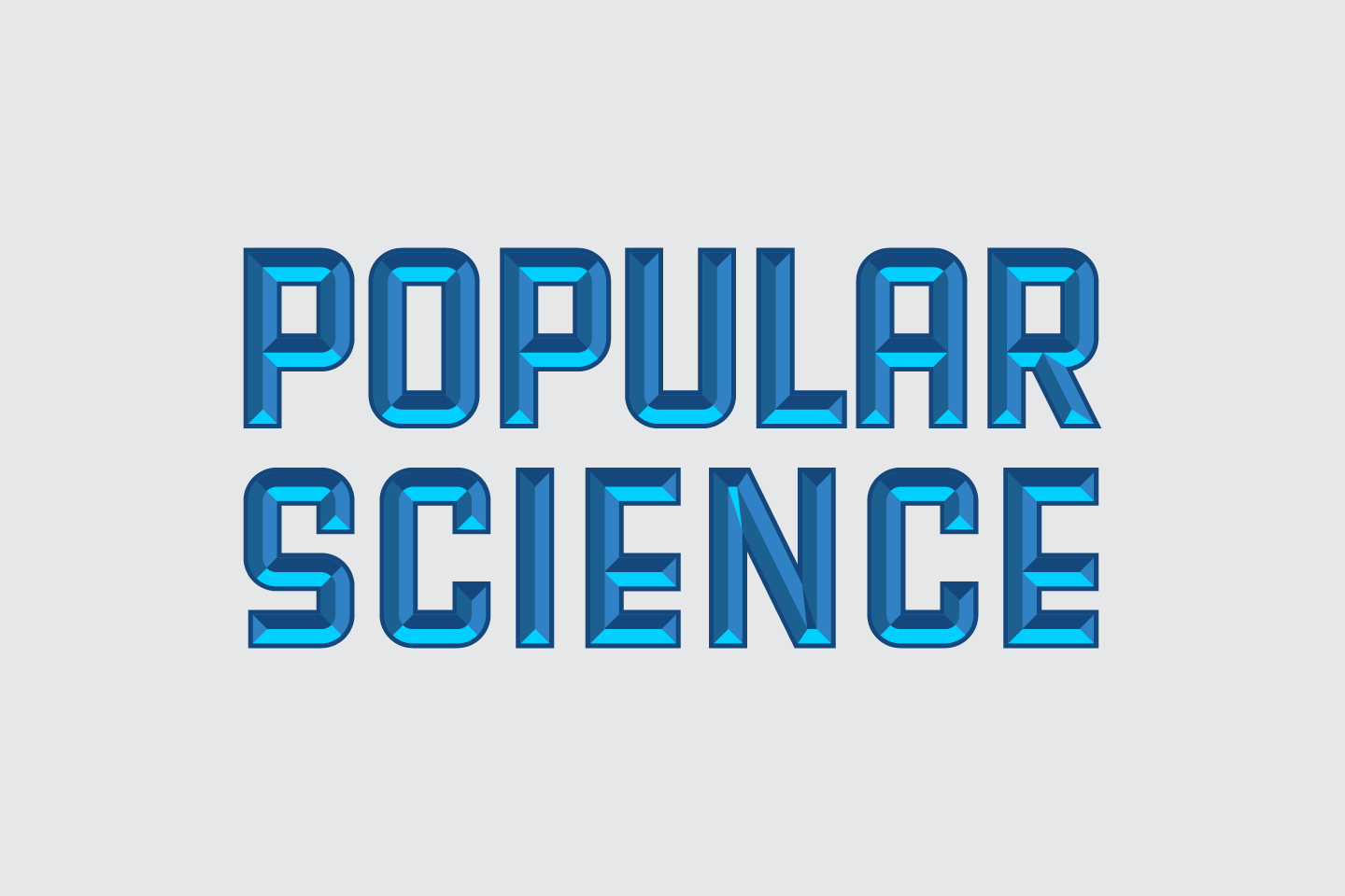
Drawing inspiration from those great covers of the '20s and '30s, I decided to revamp the face of Popular Science to create a cover that wouldn't overload the senses but still stir the imagination. Borrowing the white frame of '25 gives the magazine some much needed breathing room. I drew a new masthead from scratch that mimics the gaspipe lettering from '35, with a little added dimensionality. The article titles are relegated to their own space, letting the feature illustration take center stage.
I didn’t stop at the cover. Inside, the layouts are simple and structured. The featured article, “The Hunt for the God Particle,” sports an interesting typographic combination of Lydian (for headlines and pull quotes), Melior (for body), OCR-A (for marginalia), and some sixteenth-century German Fraktur for added piety. The page layouts are embellished by exposing the “divine” proportions used to construct the magazine.
Conclusion
In the time since I took on this redesign project, Popular Science got a new editor-in-chief and underwent a substantial visual transformation, something for which I’m truly grateful. Still, the process of redesigning the magazine for myself was such a rewarding journey, even though my version of the cover will (probably) never grace store shelves.


