

Case Study
Control4 Branding
Hypothetical Redesign
Scope: Logo design, branding, art direction
This project is a hypothetical exploration into a real company and its existing brand. I approached the project as if it were an actual corporate redesign and developed an entirely new logo and identity system for the company.
Background
Founded in 2003, Control4 is a leading manufacturer of home automation products designed to control almost any device in the user’s home or business. Their products are primarily used to control lights, sound systems, video, security cameras, and heating and air conditioning in a single room or throughout an entire house. Control4 control panels are designed to cooperate with existing technology.
Research
Control4’s identity has remained fairly consistent throughout its sixteen-year existence. One major change ocurred when the logo was redesigned. The original logo that was implimented in 2003 was phased out around 2012 when the current logo replaced it.
The current logo is pretty tame and unremarkable. The wordmark is typeset in Gotham with very loose tracking, causing some spacing issues (with the “C” almost floating away). The “4” in the logo is a modified Gotham numeral and is encircled by a crescent moon shape.
Below are a few examples of existing brand elements in use across Control4’s website and products:


Control4 has spearheaded some of the most groundbreaking advancements in the home automation arena, and they deserve a brand to reflect that. By embracing a redesign, Control4 could present a fresh face to the public while communicating the futuristic concept of an automated home as a realistic solution for today’s consumers.
Process
I started the rebrand process by taking in as much of the existing brand as possible, digesting what worked and didn’t work, and began to formulate some possible directions to take the brand. I new I wanted to preserve the Control4 name, because it’s unique and it holds a lot of brand equity. It also alludes to the four areas of home automation (lighting, security, comfort, and media). The next step was coming up with some new logo concepts. Here are a handful of the more promising directions:

In the end I opted for simplicity, and decided to move forward with the bottom right-hand option above.
Solution
The logo would be the cornerstone of the entire identity, but it was only the beginning. I eventually created an entire brand book filled with my process and detailed examples of brand applications, which you can see below. Enjoy!


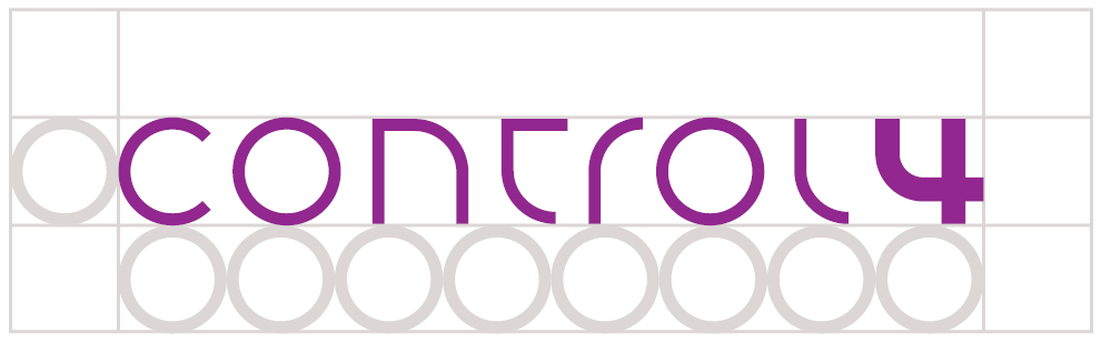
The Control4 logo is built entirely from perfect circles, semicircles, and straight lines at 90° angles. The lineweight of “CONTROL” is ¹⁄₃ of that of the “4.”

Using the letter “O” as 1 unit, the logo is exactly 8 units long and 1 unit tall. At least 1 unit of space should be left clear around the logo in all applications.
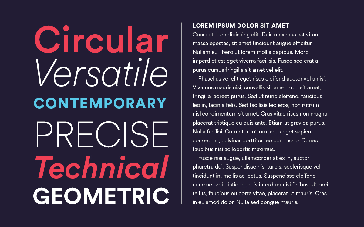
Visual Language
I further developed the brand by defining specific company colors, typeface usage, and icon design guidelines.


(As compared to the existing icon set on current control panels.)
Brand Applications
To test the feasibility of the new identity, I applied the branding system to a variety of real-world applications.


Conclusion
This project was one of the most extensive branding experiments I’ve ever taken on, and it was also one of the most rewarding. I’m really proud of the solution I ended up with. I not only achieved my goal of updating the company’s logo, but I got to develop an entirely new, sleek identity along the way.
